I have chosen some promotional posters that I quite like and would like to have a look at the similarities of them and the differences.
This is a Madonna promotional poster. I like the fact that it is rather colorful, this is a very good way to attract the audience. The posters main subject is the artist and this is clear as the poster includes a big heading of the artists name, a big photograph of the artist face is also included, which lets the audience recognize the artist straight away. This poster maybe eye catchy, but I believe that it does not include enough information about the album or what ever is advertised. The month of the release is said but the day is nowhere to be found. Overall I believe that this could be more successful if it had more information included.

This I like due to the layout of everything. I like the fact that the artist is behind the text, even though the type is infront the audience are still able view the artist very well. the name of the artist has been said twice which may mean that he is not very well known, so people need to be reading the name to know who he is. A lot of information has been included which is very helpful, it has all been written quite bold and simple which makes it easy to read while walking past. It tells the audience the dates and the days, other artist featured, where the album can be found, what the album looks like. Over all this is a very good promotional poster as everything can be known by just looking at the poster.

This is very simple but successful. I believe that it all works very well as there is information at the bottom telling the audience when the album will come out. Also, the name of the artist has been written next to the artist, so just incase people are not familiar with this artist they can know who she is straight away. the yellow background at the bottom is the right choice as yellow is bright and catchy. The yellow covers a little bit of her but her chest is quite revealing, which may reflect the album, its songs and the genre of this music. Over all, it is successful due to the audience being able to know what the album is about, however, I am not too keen on it as a whole, as the yellow does not fit in with the photograph behind.

This I like as it is artistic. Talking about the layout I like the fact that the circle and the star have been positioned as the girls eye. The artist cannot be recognized by the picture as the eyes have been hidden. This may mean that this artist is well known and people will be able to recognize it from the way it has been made of the logo. The name has been written very big, which is a clever idea, as knowing the name oft he artist/album will attract the audience that are familiar with this artist. I am pleased with the information written at the bottom as it tells the audience where to find this album. Over all it is a helpful and an interesting promotional poster.
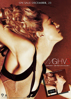
This is very simple and plain, but at the same time very successful. It includes an image of the artist, the album itself, the name of the artist and the date of when the album is going to come out. I love the fact how the artist has been made to stand out by using little and thin text, this works very well. All of the colors fit in well together, which overall makes it a very successful promotional poster.


No comments:
Post a Comment