Monday 28 November 2011

MOVING IMAGES

 While shooting my moving images I have decided to make some changes within my ideas, to make it all much more exciting. These are the changes to these shots:

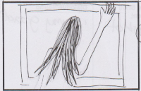
 This was supposed to be a continuos movement of the artist against a wall while a torch shining at her. However, I felt that it needed more to it, so I have came up with a new idea. I have decided to use a hall way and have the artist appear closer and closer within each shot. As the hall way was very dark I have decided to have the torch switch on and of and different places, which the artists switches. So, if the artist is right at the end the torch would shine on the artis and switch of, the next place that the torch will be shining on is the artist being in a different place. This creates a mysterious look, as the audience do not know where to expect the artist next, further or closer away, as all they see is darkness while she switches positions.
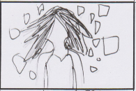


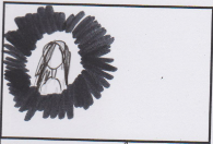
As I have said before, me and my brother have discovered an idea of using a torch creating shadows on the wall. This technique has been used on the moving images too. The camera is hand held which makes it look more rough fitting in with the broken mirror. I have also tried to use the same technique as the one above, which looks quite interesting. Half way through the filming I have remembered that the whole idea of these moving images was to make show the artists happiness due to her escaping from herself and not facing the mirror anymore. So, I have came up with some shot changes which shows the artist looking to one side of her then the other, noticing that she is free and starting to smile. As something funny happened while filming I could not stop laughing and my mum has filmed me laughing, even though it was a mistake I want to use it as the main part of the ending due to it being very natural and looking quite creepy. 

BROKEN MIRROR PHOTOGRAPHS


My idea was to create a happy look of the artist laying in the broken mirror parts. This is to show that she has escaped from herself. I believe that these photographs have came out very well, due to the interesting use of the torch and the broken mirror parts. However, I have forgotten about the happy facial expressions, which I have included later in the moving images.

SETTING UP FOR THE SHOOTING

 My plan has shown that I need a broken mirror for my photo-shoot/filming which means that I had to get a broken mirror from somewhere. As I did not have a broken mirror I had to smash one myself. After a long thinking of how to smash it without hurting myself I have decided to take it outside and put a cloth over it, so the bits of mirror do not flick everywhere. I have found one of my dads weights in the shed and thought that it was heavy enough to smash the mirror. Using my safe techniques I have managed to smash the mirror without hurting myself, although I did cut my finger without even noticing, but I survived! The next thing to do was to brake the frame, which I could not do by hand. As my brother had solid shoes on I have asked him to kick it, and it has worked very well as it broke in half.

As the mirror has been smashed I needed to set it up in a room on the floor, to make it look like it has been smashed in the room, on the floor. As I have set it up it has came out rather well, as it did look like it has been smashed in this room. Not perfectly, as all of the broken mirror bits would flick all around the room, but I wanted all of the glass to be together to make a better effect.

As I have layed out the broken mirror, my brother has noticed the reflections on the wall. I have found this very interesting and have decided to see if it would work better in the dark, using a torch. As we have tried this out, it has came out very interesting and looked quite magical, which fits in with the video, as the artist escapes from herself she feels happy.

28 NOVEMBER, Journal

I am up to date with my plans made on friday! Which is making me very happy as I can start editing soon! I have filmed all of the shots that I have planned to, and it has all came out very successful. I have came up with new, greater ideas which I will go into in more detail a little bit later. I have also taken some photographs just incase I do not want to use the footage which have came out rather well too. Everything has been documenting, such as me smashing a mirror, to show the process of making.

Friday 25 November 2011

PROMOTIONAL POSTER EXAMPLES

I have chosen some promotional posters that I quite like and would like to have a look at the similarities of them and the differences.

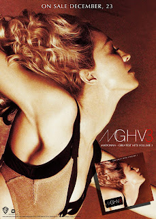
This is a Madonna promotional poster. I like the fact that it is rather colorful, this is a very good way to attract the audience. The posters main subject is the artist and this is clear as the poster includes a big heading of the artists name, a big photograph of the artist face is also included, which lets the audience recognize the artist straight away. This poster maybe eye catchy, but I believe that it does not include enough information about the album or what ever is advertised. The month of the release is said but the day is nowhere to be found. Overall I believe that this could be more successful if it had more information included.
 This I like due to the layout of everything. I like the fact that the artist is behind the text, even though the type is infront the audience are still able view the artist very well. the name of the artist has been said twice which may mean that he is not very well known, so people need to be reading the name to know who he is. A lot of information has been included which is very helpful, it has all been written quite bold and simple which makes it easy to read while walking past. It tells the audience the dates and the days, other artist featured, where the album can be found, what the album looks like. Over all this is a very good promotional poster as everything can be known by just looking at the poster.
 This is very simple but successful. I believe that it all works very well as there is information at the bottom telling the audience when the album will come out. Also, the name of the artist has been written next to the artist, so just incase people are not familiar with this artist they can know who she is straight away. the yellow background at the bottom is the right choice as yellow is bright and catchy. The yellow covers a little bit of her but her chest is quite revealing, which may reflect the album, its songs and the genre of this music. Over all, it is successful due to the audience being able to know what the album is about, however, I am not too keen on it as a whole, as the yellow does not fit in with the photograph behind.
This I like as it is artistic. Talking about the layout I like the fact that the circle and the star have been positioned as the girls eye. The artist cannot be recognized by the picture as the eyes have been hidden. This may mean that this artist is well known and people will be able to recognize it from the way it has been made of the logo. The name has been written very big, which is a clever idea, as knowing the name oft he artist/album will attract the audience that are familiar with this artist. I am pleased with the information written at the bottom as it tells the audience where to find this album. Over all it is a helpful and an interesting promotional poster.


This is very simple and plain, but at the same time very successful. It includes an image of the artist, the album itself, the name of the artist and the date of when the album is going to come out. I love the fact how the artist has been made to stand out by using little and thin text, this works very well. All of the colors fit in well together, which overall makes it a very successful promotional poster.

25 November, Journal

As I have sorted out my production schedule and my record label, there isn't much I can do. So, I want to start making my promotional poster. I will use one of my images that I already have from my previous Photo shoots  as they fit in with the album. I would like to make a few poster choices and maybe have a look at some examples of they layouts, just so I know what needs to go on the poster. The genre of the examples is not very important as most of the promotional posters contain similar things.

RECORD LABEL


I have been looking for a suitable record label for my artist, and it has been very difficult to find. This is because, I need a specific record label, which preferably should be british and the genre of experimental has to fit in. While researching independent record labels, I have came across an unknown record label, which has caught my eye. All of the artist seem very interesting and unique, which really fit into the genre of experimental. This record label is hardly known which is very interesting as it makes it hard to find information about it. This record label is called type records, and the only information about it given is 'We are a record label'., which is of course not helpful at all.


While looking at their website I have found  their twitter account and I have found out more information about them. I now know that they are from Malde, MA, USA.

I have also had a look at the artist signed to this record label and I have found out that the artists signed to  Type Records are from all over the world including Sweden, Australia and many more. Each artist has images representing them, which all of them are amazing and unique. Here are some of the one that I love;


Looking at this record label I have finally made a decision, and my decision is that this record label is the one! It fits in very well with my artist AND the genre experimental! I have had a word with my teacher and she agrees with this statement, and this means that my record label is sorted!

BLOG FEEDBACK, 25 November 2011

Today we have found out that our teacher has left us comments on our blogs with our current grades/target grades. She has also left notes on what could be done better and improved. I would like to look into these comments more, and see what changes can be made. 

My teachers has stated that my spelling needs to be checked, which makes me want to go through my whole blog carefully and check my spelling mistakes, for improvement within my blog.

As I have changed my record label, it still does not fit in with my genre of music as well as the artist. So, once again I am going to change it into a less mainstream record label, for it to fit in with everything.

PRODUCTION SCHEDULE


As I have finished my digipac, I feel like I am ready to film more scenes.  I would like to keep the 'pen tablet' idea for the end of the shooting, as I believe that it will be the most difficult one so far. This is because I have never used Pentablet, and therefore I do not know if it will work. I am going to aks my mum for help, as I believe that she has the chance to use it. In the mean time, I would like to get the rest of the shots out the way. I have borrowed a Flip camera from the media department for the weekend, so hopefully I will get everything done up to plan.


DATE: 25/11/2011  
LOCATION: My house
TIME: 14:00pm - 17:00pm
PROPS: A torch/make-up/a white dress/tripod/flip camera/ladder/mirror/smashed mirror
CAST: Me as the artist,an extra person to film me. Another person will be needed for the torch shots.

SHOTS WHICH NEED TO BE SHOT


Thursday 24 November 2011

DIGI PAC MADE!

I have finished making my digi pack. I have found it a success as it looks like a real digi pac. I also think it is successful due to good feedback from the people that have had a look at it. The feedback was'I don't want to give it back to you' 'I would buy it even if I didn't like the music' 'It's amazing'. However, even though everyone liked it, one of my teachers has given me a few pointers to improve it, which was to write the name of the album and the artist on both spines, she as also said that it feels a little empty when it is open, and maybe I should add a booklet inside. One of her pointers was to take the price of, but I do not think I will be able to do that as I would have to rip the whole image of and this may ruin my whole digipac.


I have not uploaded the CD sticker as it is on a different computer. It includes the copy right information, an image of the artist lying down on a mirror and the logo, which represents the name of the artist and the name of the album. I have decided to use an image of the artist lying down on a mirror, as it looks like she is lying on the cracked mirror which is on the inside right.

Wednesday 23 November 2011

MAKING THE DIGI PAC

I have decided to go of and actually make my digipac as I did not find it very effective as a digital copy. So while making my digipac I have came up with some changes. This is to make it more exciting and to fit in with the narrative of the whole album. I have based the whole album on the main song 'Fall foliage' as it lays the artist out as she is. I have also forgot to mention that the name of the album is the same as the name of the artist, as it all fits in well together.
THE CHANGES MADE:
INSIDE RIGHT: So for the inside right I have felt that using just a plain mirror would not come across very exciting. I have decided to use one of my mirror images and a plastic mirror. I want to cut up the mirror to make it look like it is broken, and stick my mirror photographs underneath. This I believe would be much more appealing tot he audience.

INSIDE CENTER: My previous image for the inside center was a screen shot from the video of the artist falling. I did not find it very attractive as it was hard to make out what it was, so I have changed it into a projection instead. I have also want to print the photograph on transparent paper to make it look unique.

This draft does not include the spines, but the spines are going to be the same as they were planned before. Black spine with white writing on it, saying 'The Grudge' (the name of the artist and the album)

I have also added some copy right information, a bar code, the price and the Sony BMG logo ont he back of the digipac. 

DIGITAL DIGI PAC

I have finally made my digital digi pac using the original photographs that I have taken during my photo-shoots for the video. I have used Photoshop to put it all together, which was rather easy as I am already familiar with photoshop. 
 

RECORD LABEL

Thinking back to when I was showing my pitch to the class, my teacher has said that the record label which I have chosen (Rough Trade) would not be that alternative. By that she meant that it would be a good idea to change it. So, I have chosen a new record label which is 'Sony BMG'. Although it is a mainstream record label, I think that it would work well with my artis as it is very well known.


Sony BMG Music Entertainment was a recorded music company, which was a 50-50 joint neture between the Sony Corporation of America and Bertelsmann. The venture's successor, the again-active Sony Music entertainment, is %100 owned by the sony Corporation  of America.

Friday 18 November 2011

EDITING MOVING IMAGES


As I have planned to edit my moving images which I have filmed at home, my plan was successful. I have chosen not to edit all of them and choose the best ones which work well. So far I have edited four videos. I believe that they look very effective and fit the genre of my song/video.


THESE ARE THE SHOTS THAT I HAVE FILMED AND EDITED:


 As this has been edited it looks very effective and interesting. I also find it rather creepy due to it being reversed. This really fits into the genre of experimental, which I would say is successful. I have also changed the levels of this shot and have made it black and white, as I want my whole video to be black and white. To make it more interesting I have decreased the speed of the reversed falling, which works well also.


This I have also edited the same. Slowing down the speed, playing round with the levels and the saturation. It all works well as it is rather bright but the make up is dark which shows her feelings, and the feelings that she wants to have. 

Wednesday 16 November 2011

16 NOVEMBER, Journal


As I am in school I cannot do any filming, due to me not having any of the props. So, what I am going to do today is edit my moving images using final cut pro. Making them black and white, taking the sound of and playing around with the contrast and the levels.

Monday 14 November 2011

FEEDBACK


Friday, 11th November

On Friday we have presented our pitches to the whole class. Each group has been given a feedback sheet to fill in as other groups have gone through their pitches. I believe that presenting my pitch was very unsuccessful as I was very nervous and could not get my ideas across like I had them in my head. However, looking at the feed back sheets I have noticed that the results were not actually bad. One group out of the five have gave me two stars and the rest of the groups have given me three stars, which I was very happy about. The other feedback I will take on and use for my music video/the process of making. These are the results of my the feedback: